Is your farm website helping you win customers? Or is it chasing them away?
Farm websites help customers see the effort and passion that goes into growing quality food. It educates and encourages new business.
But is your website working for your farm?
In this post, I’ll give you six ways to ensure your website showcases the quality food that you produce.
Ready to start winning new customers?
1) Remove those dog, wedding and baby photos
I have farmer friends that plaster their business website with family and pet photos. They love it, but nobody else gives a shit.
Sorry, it had to be said.
Customers want to see your passion for growing amazing food and learn about how you farm. They want pretty landscapes, healthy animals and happy people.
Put a short bio with a few pictures on your ‘About’ page, but please, leave it at that.
2) Give your farm website a purpose
Besides displaying relevant interesting information, you should have a clear goal about what your website should do. For example:
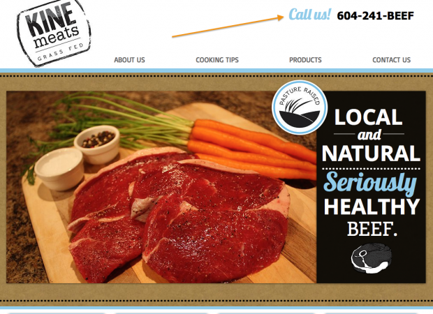
Lead visitors to make an order:
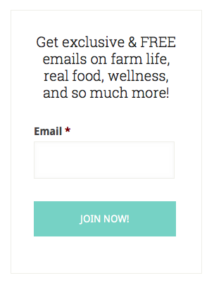
Lead visitors to sign up to your farm newsletter:
Make sure you are clear about your main goal, otherwise visitors will get confused and leave.
3) Whet their appetite
Think about a CV (resumé). A CV doesn’t get you a job, the interview does. A CV just gets your foot in the door. That’s why an attention getting one-pager is more effective than 5 pages of blah blah blah.
The same applies to your farm’s website. It has to clearly communicate your message and lead them the action you want them to take.
4) Remove clutter
With today’s simple website content management systems like WordPress or Concrete5, farmers can easily keep their websites up to date.
But it can quickly turn into a mess.
You must remove clutter from your farm website. That means one large photo per page. It’s ok to have max 2 small supporting pictures, but consider putting them in a separate photo gallery page.
Text should be limited to a few short sentences per page.
Why?
5) Make it easy to read
Attention spans are short. If it’s hard for people to find what they are looking for, they leave.
Break pages up into sections with key points emphasised. Most people just skim.
A well structured and clearly presented website shows that your business is organised, efficient and quality focused.
6) Use a professionally designed website template
You wouldn’t ask a pro web designer to move the cows or dig a hole for a fencepost. You also shouldn’t design your own website. If you’ve ever seen a soft-handed city slicker hold a shovel, you’ll know what I mean. :)
Even if you have the skills, it’s probably not worth your time. There are plenty of beautiful website templates available for free or inexpensively.
Don’t even think about any of these either…
- Funky fonts (especially Comic Sans)
- Web page counters
- Flash pages
- Under construction messages
- “Click to Enter” welcome pages
- Animated gif images
- Frames
- Scrolling text
You’re a farmer, why should you care?
You don’t just run a farm, you run a business.
You put your life into growing quality food to feed healthy, happy people. You sell directly to your own customers.
Many customers will only see your farm via your website. They want to give you their money.
Let’s make that easy for them.
Flickr Creative Commons image via Massimo Regonati.

